I created a mobile application version of my desktop counter.
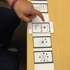
I created an initial version and tested with my co-worker. I envisioned a home screen that would include everything you are counting and icons that indicated accomplishment as well as status bars. Then you could enter each item to increment in the direction that you chose, reset the counter, or delete the item entirely. On each count, you would press down for an animation and when it was complete you’d return to the item’s page where you’d see a change.
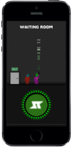
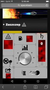
The animation and buttons were inspired by a mobile game I enjoy to play a lot, called Spaceteam. To play, you communicate instructions verbally to 1-3 other players, in order to keep your ship safe on its journey. For a simple counting application, I thought something like the button you press in the waiting room might be effective–it lights up and your player beams a laser into the air. To start the game, all the players must be holding down the button at the same time.
I created progress bar animations to further demonstrate the idea. One goes forward, for incrementing up, and the other goes backwards, for incrementing down (code on github).
When I tested my initial mock-up, it was clear I could still make things simpler. He was confused by the several icons and there were too many potential interactions on the pages to increment up or down. I realized I was being inconsistent with iconography to increment up and down, sometimes using arrows and sometimes using +/-.
In the final version, you can increment up and down by going through the initial landing page or the item landing page, so you can skip the animation if you’d rather. I also got rid of the “Remove Item” button and added functionality to remove items like iMessages. I made it simpler to add items, but also now allow users to change and update the emojis they associate with each item they’re counting.
I see a few more things could improved– the “Reset” button may more clearly be “Edit” and I think there could be more interesting or diverse animations. The Counter++ joke is kind of lame, so I think in addition to more user testing, a next step should probably be branding.


