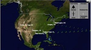
My final project, F3EA: Find, Fix, Finish, Exploit, Analyze is online here. And my source code is available here.
An introduction page gives a recent history and some background to the project. Viewers can click anywhere to continue to the main page, an animation of how information flows from drones used for surveillance, signals intelligence, and strikes in the middle east and north Africa through military bases all over the region to the United States. In the United States, communications between drone pilots, analysts, and political leaders in Washington is also shown. Mousing over different symbols displays more detailed information for each leg of the journey, and explains how information gathered is used to decide and then carry out strikes. Click-zoom allows you to focus on the United States, the middle east and north Africa, or the whole world.
Information design inspiration
When I originally proposed this project, I looked for artists that did work related to drones. A lot of the work I found was drone photography, almost all of which had some kind of imagery or posed some thoughtful question that influenced the way I chose to depict the world. But particularly on a map, symbols become very important, and there were a few pieces of journalism that included smart design that I referred to a lot.
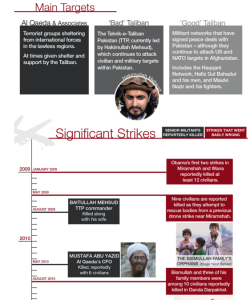
I think the Bureau of Investigative Journalism often does a great job incorporating text with visual information that also gives context and sense of time.
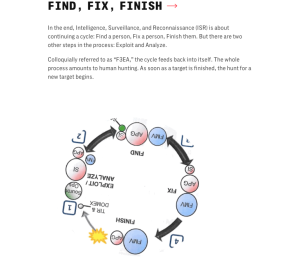
Josh Begley, whose work inspired this whole line of inquiry, also worked on a visual glossary for the Intercept’s recent report, The Drone Papers.
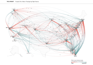
Unrelated but cool was this visualization of Thanksgiving travel in the New York Times. I thought this was a great way to depict movement.
Feedback
One piece of feedback I found helpful but didn’t incorporate was the impersonal nature of maps. I think incorporating photo could bring a more nuanced perspective to the drone strikes themselves–for example, including photos of actual people involved in each of the steps of the process, or being able to zoom in to ground level. A more ambitious project might be to take photos of people replicating the kind of images that drones produce, and somehow incorporating these into the experience.
Some more technical feedback I got did make it into the project. First, I started out with small projected balls flowing across the screen, but it was unclear what these were supposed to depict. Someone suggested symbols that look more like antenna tower signals and to include antenna towers–which I think works much better. They also suggested more visual effects, and icons representing different kinds of data, which ultimately led to me developing a key.
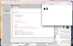
I created these generic drone symbols to represent drones used primarily for surveillance versus those used primarily for strikes (although these also carry surveillance equipment) based on this awesome drone guide.
Testing revealed some issues with sticky roll-over, which should be corrected. I think starting out with a map was maybe confusing to people without any context or introduction, so hopefully my initial timeline will help. A showed this to people separately, so hopefully all together this still makes sense.
I got mixed feedback on the click-zoom but ultimately kept it. I actually had a lot of trouble finding maps online that I might be able to replicate that included zoom functionality I liked. I tried bolding headers, and this was also pointed out to me as an improvement. I thought I was coding bolding incorrectly in my HTML, but actually the font I am currently using does have bold headers, it’s just hard to tell in Chrome.
One last thing is I didn’t test in other browsers until the very end, which was definitely a mistake. Making all the objects on the page work relative to each other in a way that will work consistently is very difficult!
Editing
There are a number of other choices I made between the prototype and the final (or, beta, maybe) project.
I eliminated city names because I felt these were cluttering the page with redundant information. I also decided in order to have a more focused purpose (I’m still not sure how successful I was in maintaining focus) to not incorporate an animation of drone strikes over time on the middle east/north Africa map. Maybe at some point it will make sense to re-incorporate this, if I can find a way to make it less busy and confusing to do so. Right now, sums from the data are presented in the mouse-over text.
Learning HTML & CSS
I created most of the HTML elements on my site with HTML rather than using tools in the P5 DOM library. The first reason I did this is because my ultimate ambition is to learn D3.js, and this requires more experience with both HTML and DOM. I wanted experience using these outside of P5 and thought if I ever re-visit this project it might be useful to have these elements exist without javascript needing to create them. The second reason is that from the Lynda videos I watched on web design, it seems like best practice to have all information accessible on the page even when users might have some browsing functionality disabled. Around the same time I started learning about basic web design, someone posted some article to Facebook about the benefits of browsing with javascript turned off–a “simpler web.” So, the javascript I wrote (except for the back button) just manipulated HTML elements that already exist, and that would be generated even in the absence of all the scripting.
I also included a very simple CSS stylesheet!
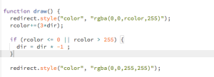
You cannot dynamically change color like this, which makes sense because rgba information is being read as text, not variables
Meta stuff
Throughout this project I kept thinking about how a lot of the kind of things I’m interested are either hard to measure or have difficult–either sprawling or incomplete–data. Part of the reason I thought Josh Begley’s Dronestream was so awesome was because it was able to organize data difficult to organize in a way that made sense. I found myself consolidating information that was effectively presented, but in a particular way: lots of text. I read an entire book, several multi-part articles, and there are hundreds of pages of arguments online and in academic journals written by lawyers and professors who study this topic. Summaries and symbols lack the nuance of these other media.
Another thought I had while coding, mostly by myself but occasionally showing it to others, is that in production environments you often have two people writing code, or one person writing and one reviewing. I’m sure there are features and functions I am underutilizing, and ways I could be doing something more efficiently. I wonder if people would be interested in instituting some kind of code review.
Last, after uploading my site and writing this blog post, I started getting a 505 Error on my page, which freaked me out because I had to present this in class. I fixed the problem by uploading a php.ini file to my wp-admin folder but the internet says this is a temporary fix. How do I make sure my site functions going forward?
