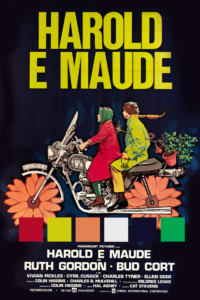
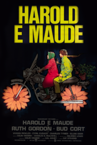
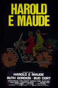
I was looking through old movie posters when I saw this one for Harold and Maude that I hadn’t seen before. I found a different version that also included the sunflower motorcycle in English, but from what I could tell this one and its variations were used for a European audience.
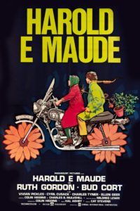 The blocks of text make the poster seem to have a square grid, though could see an argument to be made for one that runs along the lines of the motorcycle. The use of negative space emphasizes the three areas of the poster: the title, the image, and the credits. The background is also subtly given some texture with a paintbrush-like effect in a slightly different tint of dark blue.
The bright colors contrast the dark blue space to draw the eye first to the bright yellow title and the orange-pink sunflower wheels. In terms of hierarchy, the next points of attention are the smaller but also vibrant details: the figures on the motorcycle in red and yellow, then things like the plant riding on the back, the noose around Harold’s neck, Maude’s socks, and “Police” written on the bike. It’s also a compelling and funny image that reflects the zany, dark humor of the movie. Last in the hierarchy are the production credits on the bottom of the poster.
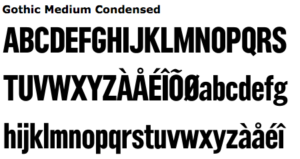
The poster uses two sans serif block fonts: Newhouse (I think condensed and bold) for the title and varying sizes of something like Gothic. I searched around but couldn’t nail down the exact font used here.
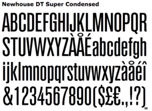
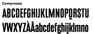
Edit: After using alternative methods to try to find the title font, I still found the title font to fit the best. The height of the bar on the A, the shape of the O and U AND D all seem right. Many similar fonts had very different M’s… I could see an argument for the leg of the R perhaps not being quite the same. After spending more time looking at font, the kerning between the U and D in “Maude” and the O and L in “Harold” became quite bothersome.

